Wednesday, 2 June 2010

End of Year Show display

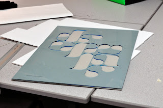
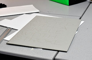
I got on the laser cutter yesterday to try out some test pieces for my end of year show display. I am going to make 9 A2 scale posters, produced using several different processes.

I tried cutting into asetate and greyboard yeasterday and I think the resluts have been really good. It has given me a nice idea of what designs will and won't work and what things will look like.

Speaking to Fred today we agree that in order for it to work and hold together as a single piece the colours need to be restained and consistant; probably a very light blue, red and then the colours and textures of the materials.


Bassment Blog Features

Phil and Myselfs collaboration on the Bassment clubnight identity has been featured on several blogs.


Above: Our work appeared on vi.sualize.us


Above: Feature on Existing Visual


Above : Bassment appeared on Design You Trust


Above: Change the thought

Monday, 31 May 2010

End of year Show Proposal


Above is my initial propsal for my display at the end of year show. I wanted to display my two most recent tyopefaces, laser cut out of asetate. They would have spot lights above them. I felt this reflected my interests both in processes and production techniques as well as typography. However Fred and Lorenxo, in the tutorial, said that this was too light and I needed to do more with my exhibition. Suggesting that, instead of producing 2 A1 posters I produce 9 A2 posters, utilising all of the typefaces I have made this year.


My Second Proposal looked like this, it uses 5 of the typefaces I have made over this year. I also utilise more production techniques, including laser cuts, digital printing and screen printing. I feel this is a more complete representation of my interests and more engaging.

At the moment I feels a bit scattered and I probably need to make it a more cohesive. I will probably use more consistant colours and materials to achieve this.

Wednesday, 12 May 2010

Mind Placement

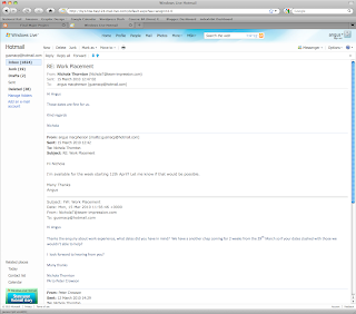
I Email Holger Jacobs at Mind a pdf of my new portfolio regarding his metion of doing a work placement. Apparently they don't have any interns at the moment because the projects they have on aren't very interesting. However he said that if I stay in touch they may have more interesting work on by the time I graduate. So fingers crossed I'll be able to do some work with the later in the year. Below is his response.

Hi Angus,

sorry for the late reply. I am actually on holiday at the moment. We don't really have any interesting work at all at the moment. All the potential projects we were hoping to get recently have fallen through. So at the moment is really not a good time for any intern I am afraid. But that might change again by the time you are finished with your degree show and everything. So I put a note to contact you again. And remind me closer to the time when you are finished. At the moment we don't have any intern at all as I hate letting intern work on projects that are totally boring and do nothing for them or their portfolio.

All Best, Holger

Monday, 10 May 2010

Print Portfolio

I got my portfolio printed out last week. I think it looks nice and I'll have something I'm proud of to show designers thta I visit or come into the college.


Tuesday, 4 May 2010

Revised Portfolio

After talking to Chris from Elmwood and also shooting some product shots of my most recently complteted work in the photo studio I made some more alteration to my PDF portfolio. Mainly it was a case of taking out the fat and making sure that everything in it I was 100 percent happy with. Chris said that you need to be able to be totally confident in talking about every project. I also moved the YTD project to the front as Chris said this was my strongest project.


Portfolio April 2010 Web

Friday, 30 April 2010

New Portfolio

Well I have been gradually putting together a new portfolio over the last week or so. This is where I am up to. I showed it to Chris from Elmwood and overall he was very positive, he suggested a few changes which I am going to act upon.

Portfolio April 2010

Friday, 23 April 2010

Team Impression: Day 5 and Evaluation

Well day 5 was kind of slow I was in the finishing unit again. In the morning we foiled a whole lot of really high spec invites that had been designed by SEA. Their front and back was printed on sepertate sheets of paper which were then duplexed. I say printed there wasn't actually any printing involve, all the text was in silver foil and there was a big number 10 debossed at the top of them. Seeing them produced was particulay interesting becasue I had pretty much followed the job through the whole system, from the art work being setup in reprographics to them being stuck together and cropped in the finish room.

Again I got a real sense of the skill involved in doing a good foiling job. Richy the guy who was showing me how the machines worked clearly took a lot of pride in what he did. After the SEA invite we worked on some business cards for Front Ideas Company. The first batch had been sent back because they had bee cropped wrong so they all had to be re done, probably a couple of thousand cards whch was obviously very frustrating for Richy.

EVALUATION

I really enjoyed my time at Team and it totally changed how I think about the production and printing process. I kind of though before I went that you just sent a file to a printers they sent it to the press and your finished product came out the other end. Obviously there is a hell of a lot more to it than this. I though this would be more automated but actually a lot of it is still done by hand and requires a lot of skill.

Maybe the biggest think I will take away from the experience is that printers definately aren't designers and as such don't really have a huge appreciation for design. Before I went I had this vision that I would be on the factory floor with all these talented printers that had a deep seated paasion for typography, paper stocks, finishing prcesses and good design now I see this was pretty naive. They are printers rather than designers and while they take a pride in what they do and go to great lengths to get it perfect, they aren't interested in the design itself.

Overall I am really glad I went to Team and I got a lot from it. But I know I definately don't want to go into printing, design is a lot more fun.

Thursday, 22 April 2010

Team impression: Day 4

I spent most of today in finishing. First I was on the guillotine, this isn't anything like the guillotines in college its huge and can cut through a few hundred sheets of paper at a time. It's impressive how powerful and accurate it is, the precision of the cut looks really good. It seemed like it would be quite a tedious job to spend all day on it however.

Next I was put onto the folding machine, or I should say machines as its a whole set of different modules which can be put together in different was depending on what is being folded. We were working on a 16 page section of a book, which required 3 folds, they can do a few thousand in an hour and obviously the quality is really high. Very clever kit and it was really interesting to see how it worked. I also got to see how the laminator worked, its really just a very fast version of the laminator in college.

Then I got taken to unit 11 which is the, where they do die-cutting, foiling, embossing, and making up boxes and covers etc. which is know as paper on board. I got a real sense of the craft in this section particulaly with the foiling, it is definately a skill that takes a lot of practice and the people there take a lot of pride in their work.

The foiling, embossing and die-cutting machines are all old modified heildelberg letterpress machine. They work in a very similar way except the plates they use are heated and just push foil onto the paper. This is the room where a lot of the really high end beautiful print finishes happen, I'm going to be back there tomorrow.

Wednesday, 21 April 2010

Team Impression: Day 3

Today was really good. First of all I was put in the digital print room. They have 2 digital presses and they're both pretty big (although not compared to the litho machines). They are pretty high tech and they keep breaking down, apparently the repair man usually has to come out a couple of times a week. However what they can do is very impressive, they print 4 colour seperations like a litho press, rather than printing all the colours at the same time like the digital printers at college. The slower one can print about 1000 full colour double sided a3 sheets an hour and each one of those sheets could in theory be completely different. However as they were saying to me the presses are kind of working at the limit of what is technologically possible, hence the reason they keep breaking down.

Then I was moved into the plate making room, where they create the printing plates for the litho presses. They can make about 16 per hour although apparently the most advanced machines can make one every 15 seconds! They showed me how the machine works, the plates are covered in enamel and 64 lasers etch the image into it, then some kind of corrosive chemical removes the exposed enamle leaving the plate ready to be used. Its a pretty inetersting process but the lad who operates the machine said its a pretty boring job.

I then went into the litho room. This was really interesting, the lito machines a litterally massive pieces of industrial machinary. They opperate incredibly fast and incredibly accurately, I found it pretty amazing to watch. They are so much studier and better built than the digital presses and clearly much more reliable. I got the impression there's a lot of skill in opperating them from the chap who showed me how they work, its more of a craft than the digital presses were its more a case of pressing buttons.

It was a really interesting day and I felt as though I got to see more of the nuts and bolts of printing which is what I was interested in.

Tuesday, 20 April 2010

Email to Mind Design Re: Placement

Holger Jacobs from Mind Design mentioned the possibility of a placement to me when he responded to the questions I sent him for my design context. I E-mailed back very quickly expressing my interest, Mind design is one of my favouite agencies and the possibility of doing a placement there is amazing.


From: holger@minddesign.co.uk
To: gusmacp@hotmail.com
Subject: Re: Typography: Product and Process Publication
Date: Mon, 12 Apr 2010 23:58:46 +0100

Hi Angus,
no problem See below. Could you correct my bad English if necessary please?
Nice work by the way. I like your Environment Typography a lot. Good luck with your degree show. Let me know in case you want to do an internship after college in case you are coming over to London.

All Best, Holger


My Response

Hi Holger


Thanks for your responses to my questions, thats great!

I intend to move down to London when I graduate and I would love to do an internship at with you at Mind. Im going to be free from Tuesday the 6th of July onwards after our end of year show. Let me know what dates would be possible for you. I will send through an updated pdf portfolio as soon as possible.

All the Best
Angus

Team Impression: Day 2

I spent most of today in Reprographics. I'd never really understood what reprographics meant or involved, at Team it is basically the bit in between the designer, creating and finishing a piece of work and then that file being made ready to go on the litho or digital presses. I'd never really realised how much work is involved turning a design we have done into something a professional printing press can use. In repro they also do all the proofing, so in most jobs they will produce a high res proof to check the colours and a low res proof to check the construction and pagination etc.

I always thought that proofs were for the clients to check that their designs were being reproduced as they wanted, but they are as much for the printers operating the presses. The people in repro will check that the proofs are perfect so when they get sent to the people operating the presses they can see exactly what they have to do.

There is a piece of software that handles the job in the estimating, quote and spec stage. The specs are then carried into another piece of software along with the artwork which produces the proofs and impositions etc. It is all a really structured and organised workflow, its very interesting to see how it works.

As interesting as repro was I get the impression its quite repetitive and could be a bit boring. I hope tomorrow they put me somewhere where I can get close up and see more of the printing and finishing processes.

Monday, 19 April 2010

Team Impression: Day 1

Well after a disasterous bus journey, I finally managed to get to Team about an hour late. I phoned ahead to let them know I'd got on the wrong bus and they were very understanding about me being late.

I got shown around the buildings, they're bigger than I expected taking up 4 medium sized industrial units. They have 2 litho presses, 2 big digital presses and hugh flatbed digital printer and a vast array of foiling embossing, die cutting foiling and fiolding machines. It was very cool to see where its all done and the fact that quite a lot of it is still done by hand.

After the tour I sat in with Glen who does estimates. Basically clients get intouch with hime when they want a quote. They send through the specs, what they want in terms of paper stocks, finishes and numbers of copies and its Glens job to work out how much its going to cost and get back to them as quick a spossible.

This is really the adimistrative side of a printers and not the hands on side which I suppose I was expecting to get exoperience with, however I found it really interesting and eye-opening to see how they work out and add up the costs of a job. It was interesting to see the software they use and how they make the calculations.

I had to leave early as I had a briefing at 1:30pm but I found the whole thing very interesting and am looking forward to tomorrow.

Saturday, 3 April 2010

TRICKLIST

Tricklist is my photography blog, which I have been running for about 4 years in various forms. While its not strickly graphic design it is a great way of getting my photography out there, my name known and raising my profile. I've just done a complete revamp of the site which involved designing a new header and a whole lot of editing of the CSS code which was pretty complicated but ultimately quite satisfying. I'm really happy with the new look and hopefully it will get me more exposure over the next few years.

http://tricklist.wordpress.com/


Tuesday, 16 March 2010

Team Impression Placement

I secured a placement at the printers Team Impression in Leeds for the last week of the Easter holiday. This is really cool as obviously Team do some amzing printing and it will be really cool to get some hands on experience at a high end printers like this.

This is the email I sent them


and this is the response

Tuesday, 23 February 2010

Website Updated

I've added a whole lot more projects to my website, tweaked the colour of the links using CSS and generally just tightened it up, so you could say it is pretty much finished. Although obviously I will keep on adding to it with new projects in the future.

Self Promo Ready to Go

Self promotion stuff is really hard to do, because it has to represent you and it has to be absolutely perfect. It's taken me a while to get it just right but I have settled on a design I am happy with.


I decided to use my original business card design from the beginning of the third year, I like how it looks and it is consistent with the branding on my website which I think is important.


I went for a consortia, A5 leaflet to display my work, I think it works well.


The companys I am sending it out to are:


Their all in North East London, because I know I will have a place to stay. All pretty dream places to work as well but I thought I may as well aim high, I don't really have anything to loose.

Thursday, 28 January 2010

Website


I have done most of my indexhibit site now, I think it is looking good and I am pretty happy with it. I still need to add a few more projects and change things round a little bit.

http://www.angus-macpherson.co.uk/

Ambassador with your indecision you are really killing me

I've been trying to design a self-promotional mail shot, but I'm finding it really hard, it never seems to be quite good enough and I can't settle on an idea.

I spent an afternoon coming up with this design, playing on the idea of Angus beef in a kind of spoof butchers diagram, but when I had finished I didn't feel it worked and it doesn't really represent my style of work.


So, sticking with the idea of using some king of information design idea to represent different parts of my character I came up with this (below). I think it works much better, it is much more appropriate and represents the style of work I do better.


So now I've got a concept for the front cover I've been having a hard time deciding about format, layout and paper stock and having a bitch trying to produce it well.


I was orginally going to simply do an A5 booklet, but I though this was a bit boring.


So I desided to add a tear off business card stapled to the side, I think this makes it a bit more interesting and reflects my interest in print and finishing techniques.


The photos on this spread keep printing out with a realy red hue.


CV on the back page.


I made some new business cards but obviously if I have a tear off business card on the booklet I won't really need them.

I just need to get the book printed well on good stock and get it sent out now.